Cy Twombly was living in Rome when he painted Treatise on the Veil (Second Version), a massive canvas now on view at The Morgan Library & Museum (through January 25, 2015). It was 1970, four years after he’d delved headfirst into a world ruled seemingly absolutely by gray and white. Twombly’s shift in style could be seen as a return to the “blackboard” aesthetic he’d first pioneered in the mid-1950s with three thickly impastoed, staccatoed canvases, only one of which (Panorama, 1955, Daros Collection, Zurich) survives today. But the artist’s gray-ground period, a five-year stint between 1966 and 1971, illustrates an abandonment of the caustic scratches of his earlier work in favor of a line that is less fragmented and more fluid, less automatic and more calculated, less shrill and more lyrical. Indeed, Treatise was inspired by Pierre Henry’s avant-garde musical composition, The Veil of Orpheus, which records the tearing of a piece of cloth. In his translation of aural to visual phenomena, Twombly reduces his subject matter to its simplest parts, distilling and crystallizing its formal components so as to strengthen its visceral effects.
Photograph showing Cy Twombly’s canvases (including Panorama at back) in Robert Rauschenberg’s Fulton Street studio, ca. 1954. Image courtesy Le temps retrouvé, Cy Twombly photographe & artistes associés, Collection Lambert (Avignon, été-automne 2011) via The Plumebook Café.
The Morgan’s installation beautifully captures the visual harmony of Twombly’s work. In all its epic grandeur (the canvas stretches more than thirty feet), Treatise sits in the center of a single gallery, a crescendo amidst a twelve-drawing accompaniment. The drawings radiate centrifugally onto the surrounding walls, at once bracketing and barricading their attendant canvas. About twenty-seven by thirty-six inches each, the drawings are supplementary but not preparatory, and they are positioned as such: separate but equal. As the introductory text asserts, rightly, Treatise is “a meditation on time and space.”[1] The curators have done well to bolster these temporal underpinnings by orchestrating the drawings in approximate chronological order. But the sheer scale of Treatise, hubristic in its spatial demands, along with its diaphanous layers of media suggests something deeper stirs beneath the painting’s surface.

Cy Twombly, Nine Discourses on Commodus: Part VIII, 1963. Oil, wax crayon, and pencil on canvas, 204 x 134 cm. Image courtesy Guggenheim Bilbao Museoa.
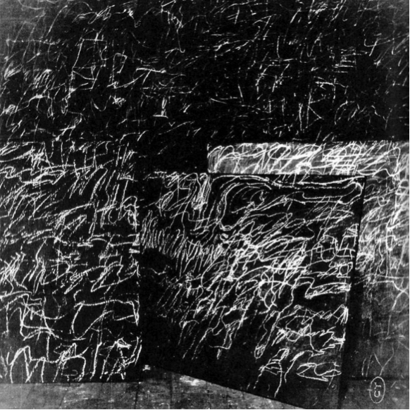
Twombly revived his muted gray palette after his Nine Discourses on Commodus (1963) (shown at the Leo Castelli Gallery in New York) received scathing reviews. The Discourses, though on a light gray ground, are punctuated by bold, frenetic clouds of color that burst and drip and streak across their upper registers. They are dynamic and painterly – that is, unctuous, saturated, wholly paint-centric. Infamously criticized by Donald Judd in 1964, the show was deemed a “fiasco,” a non-starter at the moment when painting for painting’s sake seemed (to some) incontrovertibly over.[2] Though Twombly made sculptures, too – bundled, bound, and often covered in white paint – he was nonetheless unwilling to give up on the painted medium. During the gray-ground period Twombly reigned in the extravagance of his previous work, exemplified by the Ferragosto series (1961). The results can be seen in the artist’s stark turn two years later, when he resurrected the puritanical, monochromic look of Panorama in works like Problem I, II, III (1966).

Cy Twombly, Ferragosto V, 1961. Oil paint, wax crayon, lead pencil on canvas, 164.5 x 200 cm. Private Collection. Image courtesy Thomas Ammann Fine Art, Zurich.

Cy Twombly, Problem I, II, III, 1966. Oil based house paint, wax crayon on canvas, 200 x 112 cm each. Image courtesy Museum für Moderne Kunst Frankfurt.
Placing Ferragosto V alongside Problem I, II, III manifests the artist’s shift all the more palpably: the latter are smoother, straighter, cooler, more matte. Some hardly look like paintings (hence the nickname “blackboards”). In these years, Twombly continuously manipulated two- and three-dimensional shapes against modulated gray backgrounds, a sort of control for his experiments; their scientific, ritualistic air recalls the black-and-white etchings of Josef Albers. In a 1970 interview, Albers discussed these “structural constellations” in terms of their “plastic movements of lines, place, volumes…they change in motion: from coming to going; in extension: from inward to outward; in grouping: from together to separated; in volume: from full to empty.”[3] The spatial effects that ebb and flow throughout Treatise could be described in much the same way.

Josef Albers, Structural Constellation F.M.E. 4 (JAAF 1976.8.1895), 1962. Machine engraving on black vinylite mounted on board, 49.5 x 66 cm. Image courtesy Waddington Custot.
Significantly, Albers was an artist whom both Twombly and Judd held in high esteem: Twombly had met Albers at Black Mountain College in the early 1950s and admired him greatly; Judd maintained a correspondence with Albers throughout his career.[4] The connection is important, as it points to a commonality between Twombly and Judd that is hardly, if ever, mentioned beyond Judd’s 1964 criticism. Indeed, Judd reviewed Albers’s art several times throughout his art-critical career (on at least seven occasions between 1959 and 1974). Crucial in this context is another essay Judd wrote in 1964, titled “Local History.” In it, he declares:
Most of the best painting has got to the point where it is nearly flat and nearly without illusionistic space…Because of this flatness…there is a need for something complicated and ambiguous but, unlike imitated space, actual and definite. Color and optical phenomena have this character.[5]
Here, Judd lauds Albers’s optical tricks for their ability to intimate “actual and definite” space. The fact that Judd had lambasted Twombly’s Discourses just a few months prior could be taken almost as a prescription for Twombly: do this, not that. The murkiness of Twombly’s gray backgrounds of the following years would surely meet Judd’s criteria for “something complicated and ambiguous.”

“Cy Twombly: Treatise on the Veil,” on view at the Morgan Library & Museum through January 25, 2015. Photography by Graham S. Haber, 2014. © Cy Twombly Foundation.
Treatise skirts the line between painting and sculpture. Although not sculpture per se, Treatise is sculptur-al, in size as well as content. Requiring a room large enough to house its massive frame, Treatise functions like its own architectural space, an imagined realm that opens into and onto the gallery (the obscure depths mimic the gaping mouths of the work of Twombly’s Castelli contemporary, Lee Bontecou). Moreover, Twombly’s characteristic mélange of grays could be likened to grisaille, a technique used to render spatial recession in descriptions of sculpture and architecture.[6] And, as the musicality inherent to Treatise unfolds across the canvas, left-to-right, it also weaves in and out, like two sine curves carving out a three-dimensional territory. Treatise is, then, its own specific type of “specific object;” the term is Judd’s, coined in a 1965 article by the same name, and refers to the unique intersection of “neither painting nor sculpture.”[7] In contrast to Judd’s neither/nor, however, Twombly embraces both painting and sculpture in his work.
Cy Twombly, Treatise on the Veil (First Version), 1968. Oil and chalk on cavas, 254.5 x 750 cm. Museum Ludwig, Cologne.
The first version of Treatise on the Veil, created in 1968, is all the more revealing in this light. More succinct and deliberate in his line, Twombly heightens the contrast between form and background. The rectangles spring from the inky sea beneath them, emphasizing the artist’s mille-feuille technique. This kind of building-up of the medium reiterates the sculptural feel of Twombly’s painting: although flat, even dull on the surface, the effect of the canvas is not unlike the environments of Mark Rothko and Barnett Newman.

Donald Judd, Untitled, 1965. Aluminum and lacquer, 21 x 642.6 x 21 cm. Image courtesy the Whitney Museum of American Art, New York.
For as much as Twombly spoke of the inspiration he culled from Abstract Expressionists (Jackson Pollock most of all), it is imperative that his work also be seen in the context of his peers – particularly those in the Castelli circle. To wit: Roy Lichtenstein and Andy Warhol (both of whose work Twombly collected personally), Frank Stella and, as previously mentioned, Bontecou (whose exhibitions sandwiched Twombly’s in the 1960-1961 season), Bruce Nauman, and even Judd after the Green Gallery closed in 1964. Indeed, Judd exhibited wall installations like Untitled (1965) at Castelli in 1966, the year before Twombly debuted his gray-ground paintings. In my view, it is beyond coincidental, then, that the formal arrangement of Judd’s Untitled bears striking resemblance to Twombly’s Treatise (First Version).

Installation photograph of “Donald Judd” at Leo Castelli Gallery, 1966.
What the installation at the Morgan (stunning as it is) neglects to do is to illustrate the constellation of artists and ideas that no doubt informed Twombly’s work. His early career was characterized by group shows, where his paintings hung alongside Stella’s and Bontecou’s, whose respective treatments of the painting’s edge and its relation to the wall must have raised the issue in – if not actually infiltrated – Twombly’s practice. Today, Twombly is most often displayed either alone (the Menil devoted an entire building to him) or alongside his predictable partners-in-crime, Robert Rauschenberg and Jasper Johns. In truth, the topography of Twombly’s oeuvre is much more nuanced. And so the question remains: what kinds of interpretative revelations might arise if works like Treatise on the Veil were to stand in a room with, for example, Judd’s Untitled? Perhaps then the veil of Twombly would be lifted, and, like Orpheus, we could finally experience the sublime power of his music.
[1] “Cy Twombly: Treatise on the Veil,” The Morgan Library & Museum, accessed December 12, 2014 http://www.themorgan.org/exhibitions/Cy-Twombly.
[2] The full quote reads: “Twombly has not shown for some time, and this adds to the fiasco. In these paintings there are a couple of swirls of red paint mixed with a little yellow and white and placed high on a medium-gray surface. There are a few drips and splatters and an occasional pencil line: There isn’t anything to the paintings. The poster for the show is an example of Twombly’s earlier work and is easily the best thing present. Twombly usually scribbles on a white ground, using color infrequently.” Donald Judd, “Cy Twombly,” Arts Magazine 58 nos. 8-9 (May-June 1964), 38.
[3] Josef Albers, John H. Holloway, John A. Weil, “A Conversation with Josef Albers,” Leonardo 3, No. 4 (October 1970): 462.
[4] “Josef Albers / Donald Judd: Form and Color,” Pace Gallery, accessed December 12, 2014 http://www.pacegallery.com/newyork/exhibitions/11749/josef-albers-donald-judd-form-and-color.
[5] Donald Judd, “Local History,” Arts Yearbook 7 (1964), reprinted in Donald Judd: Complete Writings 1959-1974 (New York: New York University Press, 1975): 154.
[6] My hope in raising this comparison is to answer the question of why Twombly would have cared so much what Judd had to say by looking for the intersection in their careers, finding at least one piece of the puzzle here in Josef Albers. Coincidentally, Nicholas Cullinan has arrived at an analogy to grisaille but to different ends: where Cullinan drives toward Minimalism through the grid and Twombly’s “extreme economy of means,” I step back into Twombly’s experience at Black Mountain. See Nicholas Cullinan, Cy Twombly: Cycles and Seasons, ed. Nicholas Serota (London: Tate Publishing, 2008), 123.
[7] Donald Judd, “Specific Objects,” Arts Yearbook 8 (1965), reprinted in Donald Judd: Complete Writings 1959-1974 (New York: New York University Press, 1975): 181.
